The August edition of the Storytelling with Data challenge #SWDchallenge stars the dot plot. Here is a simple plot of the gender gap in voting in national elections using the most recent 8th Round of the European Social Survey, ESS.
Getting and reshaping the data
library(essurvey) # getting European Social Survey data
library(tidyverse) # data cleaning and reshaping
library(countrycode) # converting country codes to names
library(ggplot2) # plots
With the essurvey package the ESS data can be downloaded directly to R.
set_email("your@email.here") # login email to the ESS dataess8 <- import_rounds(8) # imports Round 8 of ESSCustom theme to make the dot plot more clear:
theme_dotplot <- theme_bw(14) +
  theme(axis.text.y = element_text(size = rel(1.1)),
        axis.ticks.y = element_blank(),
        axis.text.x = element_text(size = rel(1.1)),
        panel.grid.major.x = element_blank(),
        panel.grid.major.y = element_line(size = 0.5),
        panel.grid.minor.x = element_blank())
Thanks to the tidyverse data manipulation and plotting can be done in a single block of code.
The gender gap in voting is a ratio of two proportions: (1) the (weighted) proportion of positive answers to the question about voting in the last general election among women divided by (2) the (weighted) proportion of positive answers to the question about voting in the last election among men.
recode_missings(ess8) %>%                                        # recode missing values to NAs
  select(idno, cntry, gndr, vote, pspwght) %>%                   # select the needed variables
  mutate( vote1 = plyr::mapvalues(vote, from = c(1,2,3,NA),      # recode "not eligible" to NA
                                  to = c(1,0,NA,NA))) %>%
  filter(!is.na(gndr)) %>% group_by(cntry, gndr) %>%
  summarise(vote = weighted.mean(vote1, pspwght, na.rm = TRUE)) %>%  # weighted mean
  spread(gndr, vote) %>%
  mutate(ratio = `2` / `1`,
         country_name = countrycode(cntry, 'iso2c', 'country.name')) %>%
  ggplot(., aes(x = ratio, y = reorder(country_name, ratio))) +  # sort country name by ratio
  theme_dotplot +                                                # add custom theme
  geom_point(col = "chartreuse3", size = 2.5) +                  # format dots
  scale_x_continuous(limits = c(0.85,1.2),
                     breaks = seq(0.85,1.2,0.05)) +
  geom_vline(xintercept = 1, color = "chocolate1") +             # add vertical line at 1
  xlab("") + ylab("") +
  ggtitle("Women-to-men election turnout ratio") +
  labs(caption="Source: European Social Survey Round 8") +
  annotate("text", x = 0.927, y = 22.8,                          # add custom text
           label = "women's turnout < men's turnout",
           col = "chocolate1", size = 3.1) +
  annotate("text", x = 1.06, y = 22.8,
           label = "women's turnout > men's turnout",
           col = "chocolate1", size = 3.1)
The Dot Plot
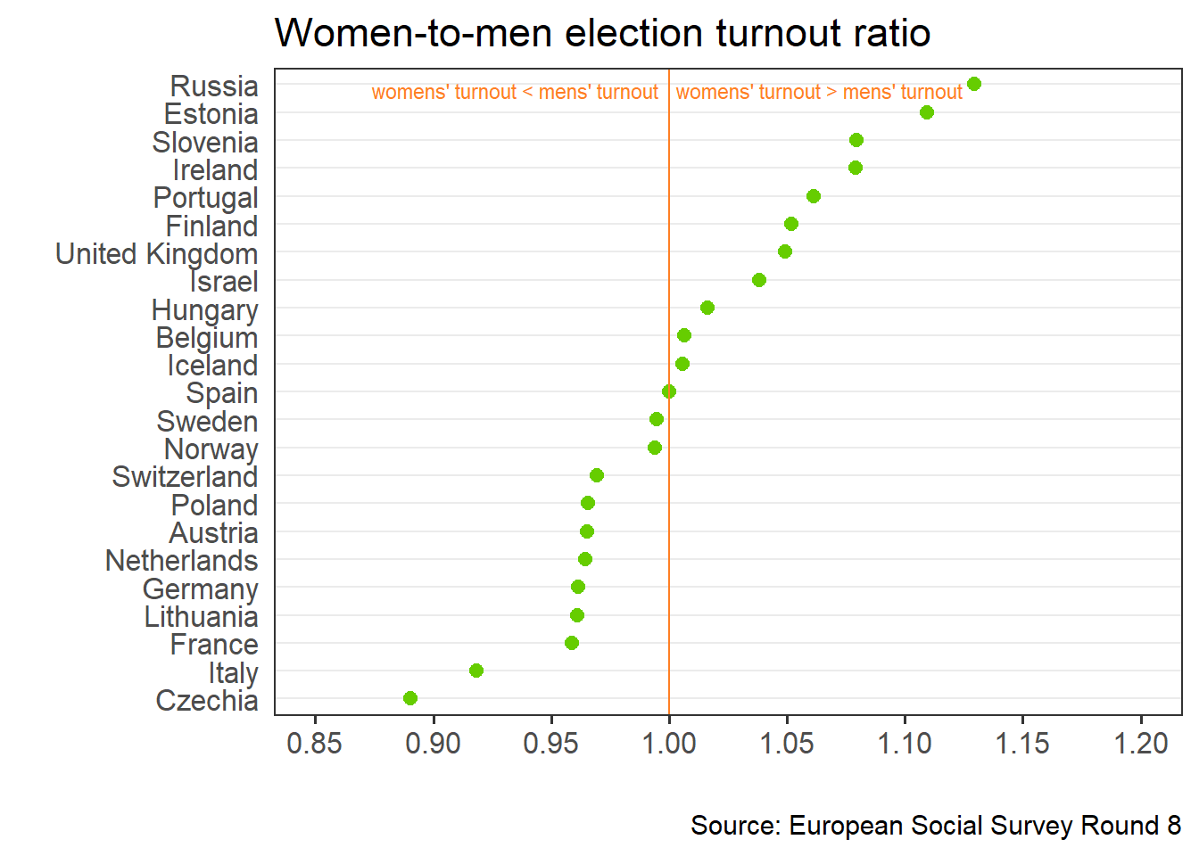
In the plot below countries are sorted according to the descending order of the turnout ratio. Values above 1 indicate that more women went to vote than men. This is the case in Russia, where declared turnout among women is 13% higher than among men. In Czechia turnout is about 10% higher among men than among women.
Overall women are more likely to vote than men in 11 out of 23 of the surveyed countries. The ratio is almost exactly 1 in Spain, while in the remaining 11 countries men tend to vote more often. There is a mix of western and eastern European countries in both groups. Who will explain this pattern?