
This year I spent two weeks of the summer attending the Summer Institute for Computational Social Science Parter Site (SICSS) in Tvärminne and Helsinki, Finland, organized by Matti Nelimarkka from Aalto University and the University of Helsinki, assisted by two TAs: Juho Pääkkönen and Pihla Toivanen from the University of Helsinki. I highly recommend it to anyone with background in the social sciences and interested in computer and data sciences, or the other way around!
The summer institute brought together 19 graduate students and postdoctoral researchers representing the social sciences and computer science. The program included a combination of computational and data skills and social science topics. One of the methods we practiced was text analysis using the tidytext package. For a group project we analyzed a collection of tweets. Below is another simple exercise in text analysis with TED talk transcripts inspired by David Robinson’s Examining the arc of 100,000 stories: a tidy analysis post.
Setup
TED talks are short, engaging and often interactive presentations from expert speakers in various disciplies, including the sciences, social sciences, business, and technology. The recordings are available on-line on the TED website as videos with subtitles in over 100 languages. Here I analyze English language transcripts of the talks using data available from Kaggle.
I start by downloading and unzipping the tedmain.csv and transcripts.csv files from Kaggle and reading the files into R. After checking the distribution of TED talks over time, I can see that TED talks didn’t really take off until around 2009, so I will select a subset of talks delivered starting with in that year.
library(tidyverse) # combine and reshape data
library(tidytext) # tokenize
library(stringr) # working with strings
library(lubridate) # working with dates
library(ggExtra) # ggplot extras

tedmain <- read.csv('data/ted_main.csv', stringsAsFactors=FALSE)
tedscripts <- read.csv('data/transcripts.csv', stringsAsFactors=FALSE)
ted <- inner_join(tedmain, tedscripts, by = "url")
ted$date <- as.POSIXct(ted$film_date,  origin="1970-01-01")

ggplot(ted, aes(year(date))) + geom_histogram(col="darkgoldenrod1",
                                              fill="darkgoldenrod2", alpha = .3, binwidth = 1)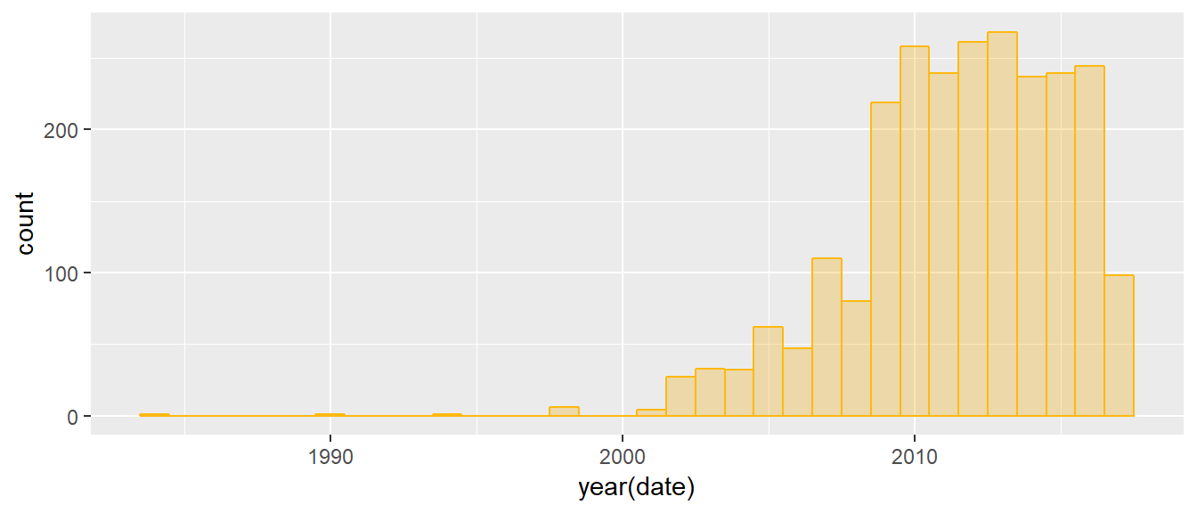
ted <- filter(ted, date > as.Date("2009-01-01"))tidy TED talks
I use the unnest_tokens function from the tidytext package package to split the text (transcript) into separate words. This creates a tidy format data frame with one word per row, which means that instead of a dataset with 2063 records (TED talks) in the post-2009 subset I now have each word in a separate row for a total of 4,033,133 rows. This enables various analyses of the text, including identifying the positions and relative positions of individual words and sentiment analysis.
ted_words <- ted %>%
  unnest_tokens(word, transcript) %>%
  select(url, word) # select these two variables only

print(c(nrow(ted), nrow(ted_words)))
## [1] 2063 4033133But first a little exploration. On average TED talks are 1958-word long. The transcript of the shortest talk has 2 words, while the longest talk has over 9000 words.
ted_words %>% group_by(url) %>%
  summarise(nwords = n()) %>%
  summarise(mean = mean(nwords),
            median = median(nwords),
            min = min(nwords),
            max = max(nwords))
## # A tibble: 1 x 4
## mean median min max
## <dbl> <dbl> <dbl> <dbl>
## 1 1958. 1936. 2 9135A closer look reveals that the talk with the shortest transcript was a dance performance with music and applause, and no words.
ted_words %>% group_by(url) %>%
  summarise(nwords = n()) %>%
  filter(nwords == 2) %>%
  left_join(tedscripts) %>%
  select(2,3)
## # A tibble: 1 x 2
## nwords transcript
## <int> <chr>
## 1 2 (Music)(Applause)Merging the tokenized talks with the information in tedmain makes it possible to see how the number of words in the transcript is related to the duration of the talk. The correlation is close to perfect, with a few exceptions, such as the already mentioned dance performance. ggMarginal from the ggExtra package creates combined scatter plots with marginal histograms.
plot <- ted_words %>% group_by(url) %>%
  summarise(nwords = n()) %>%
  full_join(ted, by = "url") %>%
  ggplot(., aes(duration, nwords)) + geom_point(col = "darkcyan") +
    labs(title="TED talks: Number of words vs. duration",
         x="Duration (seconds)", y="Number of words")

ggMarginal(plot, type="histogram", fill = "darkgoldenrod2",
           xparams = list(bins=50), yparams = list(bins=50))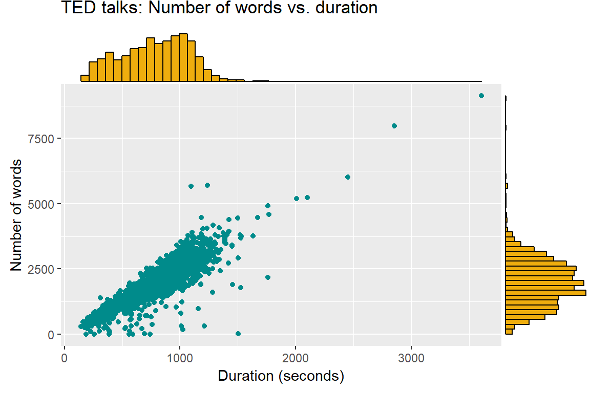
To see what were the most frequently used words, it’s necessary to do some more cleaning otherwise the top 5 will consist of “the”, “and”, “to”, “of”, and “a”. After excluding stop words and all strings with digits (like “100th”), the 20 most popular words are more meaningful. Interestingly, there are only nouns and verbs on this list.
ted_words %>%
  anti_join(stop_words) %>% # eliminate stop words  # remove stop words
  filter(!grepl("ˆà|â", word)) %>% # remove unnecessary strings or obvious words
  filter(grepl("^[[:alpha:]]*$",word)) %>% # leave strings made of characters only
  group_by(word) %>%
  summarise(n = n()) %>%
  arrange(desc(n)) %>%  # sort by word frequency in a descending order
  head(., 20)
## # A tibble: 20 x 2
## word n
## <chr> <int>
## 1 people 15442
## 2 time 8181
## 3 laughter 7620
## 4 world 7521
## 5 applause 4689
## 6 life 4574
## 7 lot 3979
## 8 day 3594
## 9 percent 3175
## 10 called 3148
## 11 human 3071
## 12 change 2845
## 13 started 2679
## 14 talk 2618
## 15 idea 2520
## 16 women 2346
## 17 data 2338
## 18 start 2319
## 19 system 2304
## 20 story 2290Applause, LOL
As shown in the “Top 20” list above, TED talk transcripts contain information about non-spoken content, such as laughter and applause. I will analyse the position of laughter and applause during the talks, calculated as the row number of that word divided by the total number of rows in the given talk (a talk is identified with url).
It turns out, not very shockingly, that applause is concentrated at the end of talks, but also happens - less often - during presentations, and there is no clear pattern as to when exactly.
Laughter can happen any time, but is a little more likely at the beginning of the talk, perhaps because some presenters like to start off with a joke.
ted_words %>%
  group_by(url) %>%
  mutate(word_pos = row_number() / n()) %>%
  filter(str_to_lower(word) == "applause" | str_to_lower(word) == "laughter") %>%
  ggplot(., aes(word_pos, col = word)) +
    scale_color_manual(values=c("darkcyan", "darkgoldenrod2")) +
    geom_freqpoly(size = 1.5) + xlim(0, 1) +
    labs(title="Relative position of applause and laughter",
x="Position", y="Count") 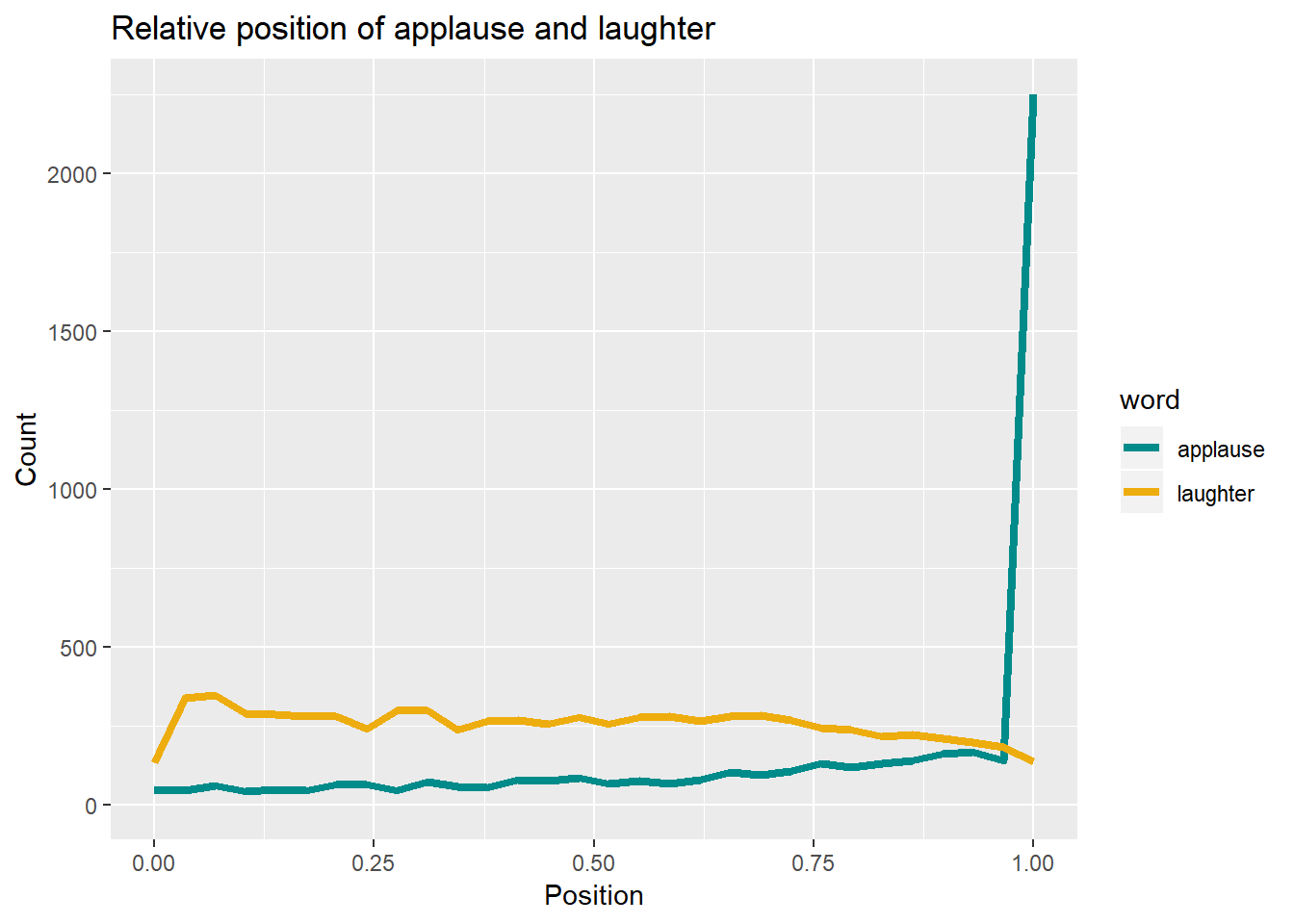
Sentiment
The final thing I want to see is how the sentiment of the content changes within talks, using sentiment analysis. On average sentiment is positive throughout and increases sharply towards the end, in line with the general idea of TED talks as spreading ideas, optimism, and inspiration.
ted_words %>%
  group_by(url) %>%
  mutate(word_pos = row_number() / n(),
         decile = ceiling(word_pos * 10) / 10) %>%
  group_by(decile, word) %>%
  summarise(n = n()) %>%
  inner_join(get_sentiments("afinn"), by = "word") %>%
  group_by(decile) %>%
  summarize(score = sum(score * n) / sum(n)) %>%
  ggplot(aes(decile, score)) +
    geom_line(size = 1.5, col = "darkcyan") +
    expand_limits(y = 0) +
    labs(x = "Position",
       y = "Mean AFINN sentiment score")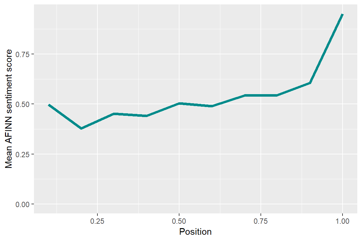
The TED talk dataset on Kaggle contains more information that would be interesting to analyze, including tags (key words), ratings, the number of comments, but that’s material for another post, perhaps.