
How to measure political inequality? The Variaties of Democracy project (V-Dem) has a set of political equality indicators that capture the extent to which political power is distributed according to wealth and income, membership in a particular social group, gender or sexual orientation (cf. V-Dem Codebook v.7.1, p. 259-262). The level of political equality is scored on an ordinal scale for each indicator by experts and then converted to an interval variable based on a measurement model.
In this post I try to construct a measure of the inequality of political participation, which can be considered a part of political inequality, derived directly from individual-level survey reported participation in political activities. I use data from the European Social Survey, round 8 via the essurvey package. I then check how this measure of inequality of political participation covaries with the V-Dem Political Equality indicator, economic inequality (from SWIID){target="_blank"}, and the Worldwide Governance Indicators.
The code for manipulating the data and plotting can be found here.
Political participation in the ESS
I apply a broad definition of political participation to include all activities that are related to politics. The European Social Survey asks about ten such activities (see the ESS/8 questionnaire). I use all of them, dichotomizing when necessary:
- following the news (1 if more than 30 minutes on a typical day; 0 otherwise),
- voted in most recent general elections (1 if voted; 0 if did not vote; case excluded if ineligible to vote),
- contacted a politician,
- worked in a political party or action group,
- worked in another organisation or association,
- worn or displayed a campaign badge/sticker,
- signed a petition,
- taken part in a lawful public demonstration,
- boycotted certain products,
- posted or shared anything about politics online, for example on blogs, via email or on social media.
The last eight items are coded as 1 in the case of reported activity in the last 12 months, and 0 otherwise. The ESS Round 8 covers 23 countries.
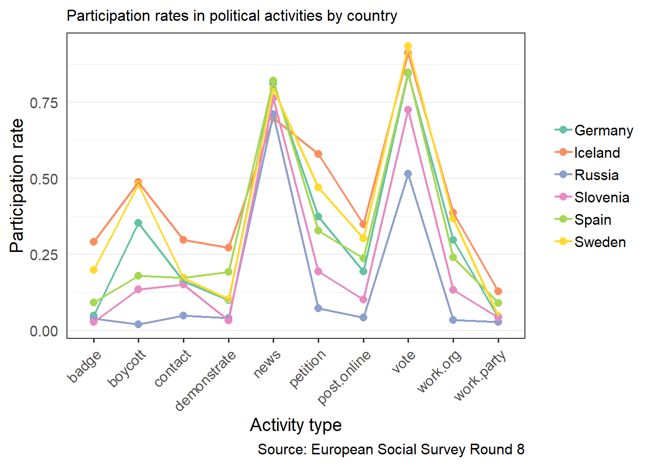
The chart below shows participation rates (proportions of respondents who reported participation in a given activity) in different activities. Including all 23 countries covered by ESS in one graph would make it unreadable, so I chose six countries representing different European regions and participation profiles.
Generally in all countries the most popular forms of political activity are following the news and voting in elections. The variation in participation is greatest for boycotting and signing petitions and boycotting products. Among the 23 surveyed in the ESS there is a country where a third of the population wears campaign badges or stickers (Norway, nor shown in the graph), and two countries where almost half of the population boycotts products (Iceland and Sweden).
The main question to ask when constructing any kind of index measure is how to weigh the components. The default is to not weigh at all, i.e. assign equal weights. The first variant of the Political Participation Score I construct is a sum of binary participation indicators divided by the sum of activities considered, i.e. by 10.
In the case of political participation not weighting participation forms might not be the best idea since some of them are easier than others (e.g., demonstrating vs. following the news), some are more popular than others (e.g., voting in elections vs. working for a political party), and some are more effective than others (it’s hard to say which ones). All these factors can additionally vary between countries due to the political situation, traditions, etc.
Any choice of weights will likely be to some extent arbitrary. I decided to use two methods.
In the first version the weight for each activity is equal to the square root of the inverse of the participation rate in that activity. Dividing the weighted sum of activities by the sum of weights in each country normalizes PPS to a scale from 0 to 1. This way of weighing rewards unpopular activities more than the inverse of the participation rate, so it will increase inequality.
The second version involves the log of the inverse of the participation rate. This method recudes the differences in weights compared to squared weights and rewards unpopular activities less than the inverse of the participation rate.
Weighting by the inverse participation rate of each activity makes all country means equal to each other, which is not great for comparisons.
As a result I have three versions of PPS:
1. Unweighted sum of binary indicators,
2. Sum of binary indicators weighted by the squared inverse of the participation rate,
3. Sum of binary indicators weighted by the log of the inverse of the participation rate.
All of them were normalized to a scale from 0 to 1.
Country levels of political participation
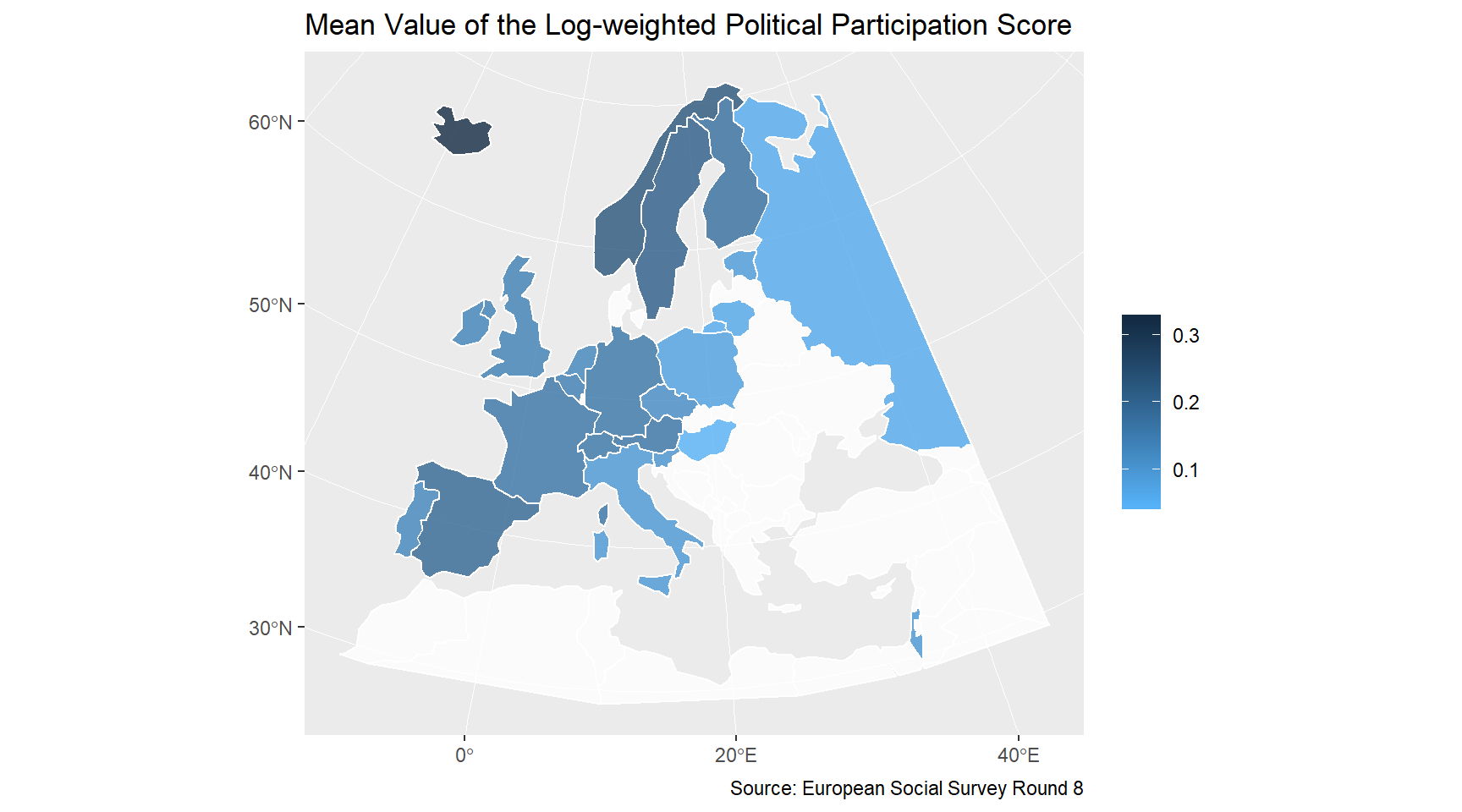
After obtaining the three variants of the Political Participation Score for each respondent, I calculate their country means. Mapping the country means of the log-weighted Political Participation Score shows a familiar pattern: Scandinavia has the highest mean value of participation, followed by Western Europe, with Eastern Europe at the bottom of the list.
Inequality of political participation
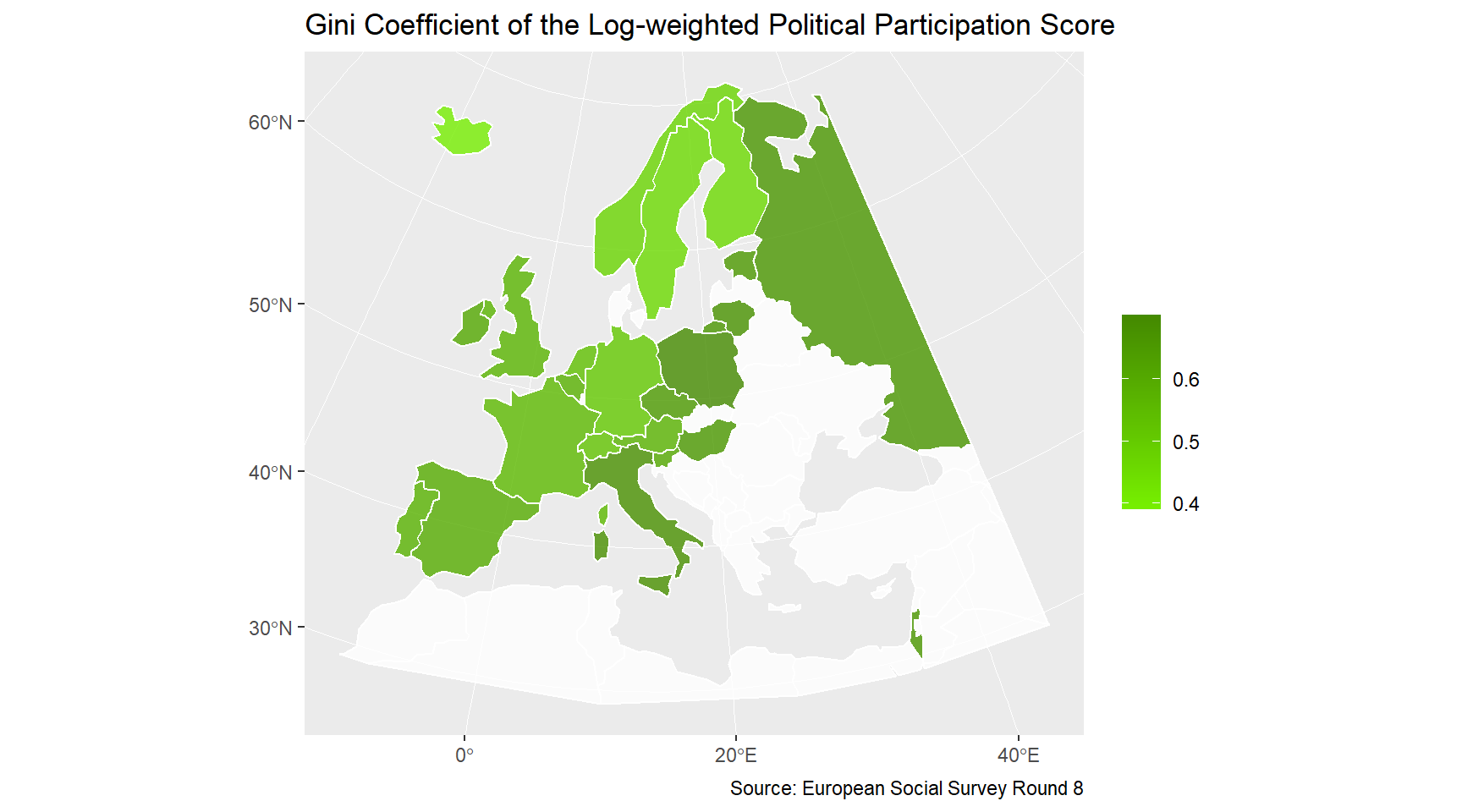
Now I construct a measure of inequality for each variant of PPS by country. There are different measures of inequality, but for this exercise I will only use the Gini coefficient. The map shows how the Gini coefficient of the log-weighted Political Participation Score is distributed spatially. Inequality of political participation is high where its level is low: in Eastern Europe and Italy, and the opposite is true for Scandinavia.
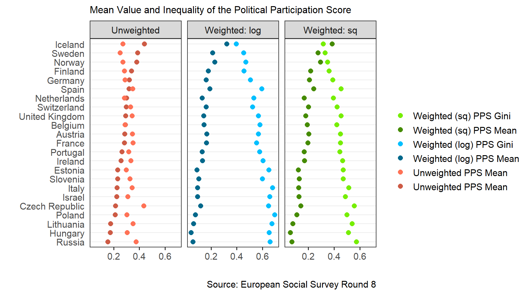
The dot plot with country mean values and Gini indices of the three variants of the Political Participation Score confirms this pattern. The mean of political participation is highest in Iceland and its inequality is lowest in Iceland (except for the unweighted PPS, by a small margin). Hungary, Russia and Lithuania have the lowest means of political participation, and are at the top with regard to participation inequality. The graph also shows that while both versions of PPS maintain the rank order, weighting increases differences in mean levels and inequality.
Democracy indicators
The V-Dem dataset (downloadable via the vdem package) aside its own democracy indicators also includes external variables, such as Freedom House ratings and the Worldwide Governance Indicators (WGI). Since the ESS data cover Europe (and Israel) only, there won’t be enough variation in the Freedom House ratings. I use WGI estimates, and the V-Dem Participatory Democracy Index, which measures the extent to which “the ideal of participatory democracy [is] achieved” (V-Dem Codebook v.7.1, p. 52). I select indicators from 2015, one year before the ESS Round 8 started.
From the V-Dem data I also extract the set of political equality indicators mentioned at the beginning, and calculate the Political Equality Index by taking the mean of power distributed by socioeconomic position (v2pepwrses), power distributed by social group (v2pepwrsoc), power distributed by gender (v2pepwrgen), and power distributed by sexual orientation (v2pepwrort).
Economic inequality
Finally, I use the Standardized World Income Inequality Database (SWIID) to get Gini coefficients of income. SWIID now has a very nice visualization tool, but raw data are also easily available. There are a few variants of the Gini index for each country-year to choose from, so I select those that deal with disposable income, OECD-modified, and monetary, and take the country mean in the case more than one value remains. This unfortunately leaves me with missing values for Russia, which only has consumption-based Gini indices. Again, I take values from 2015.
Matrix scatter plots
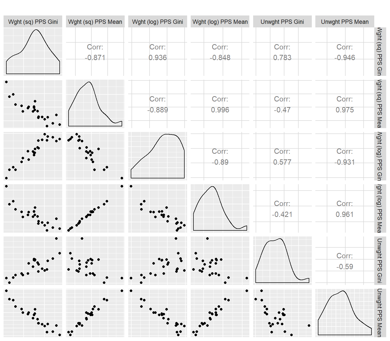
After matching all data together I can start analyses. First I will look at the means and Gini coefficients of the different variants of the Political Participation Score. The matrix scatter plot below presents bivariate plots as well as correlations and univariate distributions on the main diagonal.
Correlations between mean values of different versions of the PPS are all very strong and positive. The correlation between the Gini coefficients of the two weighted PPS is very strong and positive, and their correlations with the unweighted PPS Gini is weaker. Also, Gini coefficients of PPS and mean values of PPS are negatively correlated, and these correlations are strongest between measures with the same weight.
All in all, it seems that regardless of the method of weighting different participation forms, the rank order of countries is more or less unchanged.
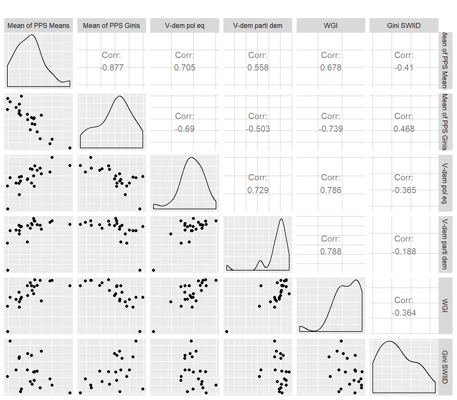
There are too many PPS versions to plot all of them against the country-levels measures of governance and economic inequality, so for each country I calculate the mean of the means of the three variants of PPS (Mean of PPS Means) and the mean of Gini coefficients (Mean of PPS Ginis). I then correlate them with V-Dem indices, Worldwide Governance Indicators (the mean of six estimates) and economic inequality (SWIID Gini index). There are a few patterns to observe:
- The PPS Gini coefficient is strongly negatively correlated with the V-Dem Political Equality index, which is a good validity check,
- The same V-Dem Political Equality index is equally strongly, but positively correlated with the PPS mean, so the higher the political equality - the higher the overall political participation,
- The income Gini coefficient (from SWIID) is positively correlated with the PPS Gini coefficient and negatively with the PPS means; both correlation have moderate strength. This means that as income inequality increases, political participation inequality also tends to increase, while the level of political participation declines.
Similarly to many other social science concepts, measuring political inequality is not straightforward. Some definitions invoke “political power” and its unequal distribution as the central concept, but power can only be measured indirectly. The inequality of political participation can be seen as the manifestation of the inequality in the distribution of political power, and can be measured with survey data, as I have shown in this post. More work is necessary to determine most appropriate ways of constructing measures of individual political participation, especially with regard to the weighting of different activities, and to select the right measures of inequality.
Political inequality and its links to economic inequality are the focus of the grant I currently work in, titled “Political Voice and Economic Inequality across Nations and Time”, led by dr. Joshua Dubrow at the Institute of Philosophy and Sociology, Polish Academy of Sciences, and funded by Poland’s National Science Centre. More information about this project can be found here and here.